
5 Easy Ways to Make Your Wix Website Look Professional in 2026

Updated: Sep 23
If you built your own Wix website, there’s a good chance you’ve reached that frustrating stage where everything is technically there…but something still feels a little off.
The good news? You probably don’t need to completely redesign your website.
The difference between a website that looks obviously DIY and one that feels polished and professional often comes down to a handful of small details. These are the kinds of things visitors may not consciously notice when they’re done well—but they definitely notice when they’re missing.
Here are five easy ways to make your Wix website look more professional in 2026, without starting over.
1. Add a Custom Favicon
A favicon is the tiny icon that appears next to your website name in a browser tab or bookmark.
It might seem insignificant, but when someone has several tabs open, that little icon helps them recognize your website. It’s also one of those finishing touches that makes your site feel like an established brand instead of a website that’s still under construction.
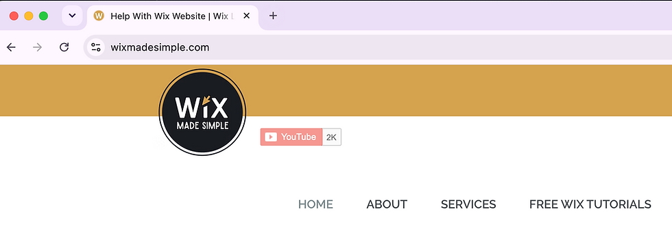
For most businesses, your favicon doesn’t need to be complicated. In fact, simpler is usually better because it appears at such a small size.
Try using:
A simplified version of your logo
Your brand's icon or symbol
A single letter or monogram
A simple shape associated with your branding
Avoid trying to squeeze your full business name into the favicon—it’ll be too small to read.
In Wix, you can customize your favicon once your site has a Premium plan and a connected custom domain.
2. Choose Your Social Share Image
Have you ever texted someone a link to your website only to have a completely random image appear with it?
That’s your social share image.
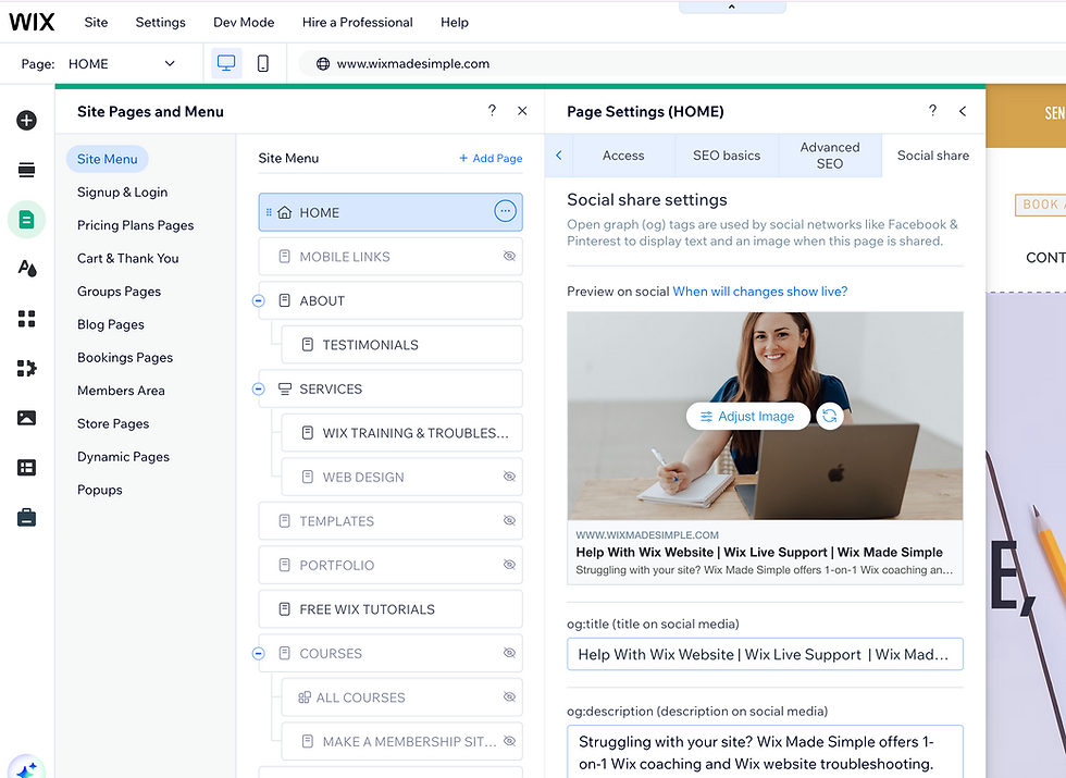
When your website or one of its pages is shared through social media or other platforms that generate a link preview, the social share settings help determine which image, title, and description appear.
If you don’t intentionally set these, you can end up with an image that doesn’t represent your business particularly well.
For your main website image, choose something that immediately feels connected to your brand, such as:
Your logo
A professional brand photo
A photo of your product or service
A simple branded graphic
Wix also allows you to customize social share settings for individual pages, which can be useful for blog posts, services, products, or other pages you expect people to share.
It only takes a few minutes, but it can make your links look much more intentional when they’re shared online.
3. Clean Up Your Page URLs
This one is incredibly easy to miss if you’ve duplicated, renamed, or reorganized pages while building your website.
You might have a perfectly nice About page…but its URL still looks something like:
yourwebsite.com/copy-of-about
Or maybe:
yourwebsite.com/about-5
Those little leftovers from the website-building process can make an otherwise professional site feel unfinished.
Take a few minutes to review the URL slug for each of your main pages in your Wix SEO settings.
Ideally, your URLs should be short, descriptive, and easy to understand.
For example:
yourwebsite.com/services
is much cleaner than:
yourwebsite.com/copy-of-services-1
This isn't about creating some complicated SEO strategy. It’s basic website housekeeping—and a very easy detail to clean up before you start sharing your site.
4. Actually Check Your Website on Mobile
Wix creates a mobile-friendly version of your website, but that doesn’t mean you should skip checking it yourself.

Your desktop design might look great while the mobile version has:
Awkwardly spaced text
Images that take up too much screen space
Buttons that are hard to tap
Huge blank spaces
Sections that feel unnecessarily long
Important information buried too far down the page
Open your website on an actual phone and use it like a visitor would.
Can you immediately tell what the business does? Is the text comfortable to read? Are the buttons easy to find? Can you navigate without getting frustrated?
And if you have particularly long pages, consider adding a Back to Top button so visitors don’t have to scroll all the way back up manually.
Small improvements to the mobile experience can make the entire website feel much more polished.
5. Give Your Footer a Quick Audit
Your website footer sits at the bottom of your pages, so it’s an easy area to build once…and then completely forget about.
Unfortunately, forgotten footers tend to collect outdated information.
Check yours for things like:
An old copyright year
Broken or outdated social links
Contact information that has changed
Links to pages you no longer use
Old business names or branding
Then think about whether there’s anything genuinely useful you could add.
Depending on your business, your footer might include your contact information, social media links, newsletter signup, privacy policy, or a few helpful navigation links.
You don’t need to cram everything down there. The goal is simply to make sure your footer looks intentional, current, and useful.
Small Details Make a Big Difference
You don’t necessarily need a dramatic redesign to make your Wix website look more professional.
Sometimes the best thing you can do is zoom out and take care of the small pieces that are easy to overlook while you’re focused on writing pages, choosing photos, and getting your site online.
Start with these five:
Add your favicon.
Set your social share image.
Clean up your URL slugs.
Check the mobile experience.
Update your footer.
Taken individually, they’re tiny changes. Together, they can make your website feel much more finished.
Want some more easy to follow guides for building your website? Check them out here:
Watch the Full Step-by-Step Wix Tutorial
Want to see exactly where to find these settings inside Wix?
In the video below, I walk through all five fixes step by step so you can follow along and clean up your own website.
Want Help Polishing Your Wix Website?
Sometimes you’re too close to your own website to know what still needs work.
If you’d like another set of eyes on your site—or you just want a real human to help you figure out the Wix settings that are driving you crazy—you can book a 1-on-1 Wix training and troubleshooting session with me.
We can work together over screen share to tackle things like mobile optimization, SEO housekeeping, design cleanup, or those last few details you’ve been meaning to fix.
There is something approachable about discussing turning curiosity into a learning adventure through situations people can actually picture. An open-ended activity can make discovery feel more inviting than a task with one fixed answer. This is why I would approach learning through exploration with a specific question rather than a fixed expectation. I would be interested in a simple example, because it is often the ordinary details that make an idea memorable. How can a learning project keep curiosity alive while still providing direction?
What interests me about exploring stories through creative reading is how a broad idea becomes part of an ordinary day. A character's journey can become a starting point for imagining a different place or perspective. I would use that point as a starting question when considering creative reading activities. The part I would like to explore further is what happens when the idea meets a real situation with its own limitations. How would you encourage readers to connect a story with their own questions?
Thinking about exploring the relationship between nature and wellbeing, I find the smaller practical questions more interesting than a quick conclusion. Noticing a familiar outdoor place can offer a simple starting point for thinking about our surroundings. It also gives the phrase ecopsychology and wellbeing a clearer meaning than a label on its own. I would probably come back to this question after trying to work through one concrete example rather than deciding immediately. How could a nature activity leave space for different personal responses?
The subject of getting started with GIMP image editing feels more interesting when there is room for a reader to stop and ask their own questions. Working on a copy makes it easier to experiment with an image without losing the original. For me, that is a useful way into the broader subject of GIMP image editing. I can imagine different answers depending on the situation, so I would want to understand the context before drawing conclusions. Which editing tools should a beginner learn before trying more elaborate effects?
I find organising email for study and work easier to think about when there is a concrete question to start from. A clear system for messages can make deadlines easier to find without constant checking. For me, that is a useful way into the broader subject of email organisation tips. I would be interested in a simple example, because it is often the ordinary details that make an idea memorable. How do you distinguish messages that need action from those worth keeping for reference?